There’s a version of the gallery wall that’s everywhere right now: perfectly symmetrical, all white frames, ordered off a single page of some big box catalog in one afternoon. It photographs fine. It also looks like nobody lives there.
Then there’s the other kind. The one that actually makes you stop walking down the hallway. Mismatched frames that somehow work together. A postcard from a trip next to a real piece of art next to a kid’s drawing that got framed because it deserved to be. That’s the wall people actually remember, and it’s the one I want to help you build.
I’ve been living in Bay Area apartments and houses long enough to know the real constraints: walls you can’t drill into, ceilings that aren’t as tall as they look in the listing photos, and a budget that doesn’t stretch to a professional art consultant. This guide is built for that reality, not for a showroom.
Table of Contents
- Why gallery walls are worth the effort right now
- The planning step almost everyone skips
- Five layout styles, and which one fits your space
- The spacing rules that make it look intentional
- How to mix frames without it looking like a mistake
- What to hang besides “art”
- Hanging it without wrecking your walls (renter-friendly)
- The five mistakes that give a gallery wall away
- FAQ
- Shopping list
Why Gallery Walls Are Worth The Effort Right Now
Plain, matched set walls had their moment. What’s replacing them is more personal: layered, a little imperfect, clearly chosen rather than ordered as a set. Framers and design forecasters are reporting real momentum behind custom art and framing again this year, and it tracks with everything else happening in home design right now: warmer palettes, more texture, more evidence that an actual person with actual taste lives in the space.
A gallery wall is one of the few decor projects that’s both genuinely inexpensive (you can build one entirely from things you already own) and genuinely high impact. There’s no equivalent return on a blank wall anywhere else in a house.


The Planning Step Almost Everyone Skips
Every bad gallery wall I’ve ever seen, including a few of my own early attempts, started with someone grabbing a hammer before they had a plan. Do this instead.
Pull everything first. Every frame, print, mirror, plate, or object you’re considering. Lay it all out on the floor before a single nail goes in the wall. You cannot design a gallery wall in your head. You have to see the pieces next to each other.
Find your throughline. You don’t need every frame to match, but you need something consistent tying the wall together. It could be color (all black and wood tone frames, no white), subject (all black and white photography), or mood (all warm, all personal, all travel). Pick one. Without a throughline, “eclectic” reads as “unplanned.”
Measure the wall, not just the art. Note the width, the height, and anything you have to work around: a light switch, a doorframe, a piece of furniture beneath it. The wall’s real estate is your canvas, and most people never actually measure it.

Five Layout Styles, And Which One Fits Your Space
| Layout | Best for | Difficulty |
|---|---|---|
| The Grid | Modern, minimal spaces; matching frame sets | Easiest, measure once and repeat |
| Salon Style | Eclectic collections, mixed sizes and eras | Hardest, most personal payoff |
| The Line | Stairwells, hallways, narrow walls | Easy, very renter-friendly |
| The Cluster | Above a sofa, bed, or console, anchored by furniture | Medium |
| The Ledge Wall | Renters, frequent rearrangers, non-committal types | Easiest, zero holes beyond a bracket or two |
The Grid is uniform frames, uniform spacing, straight lines. It’s the safest choice if you want something polished fast, and it’s genuinely hard to mess up if you measure carefully.
Salon Style is the one that gets pinned the most because it’s the one with the most personality: frames of different sizes, materials, and eras, arranged asymmetrically but balanced in visual weight. This is the style for the postcard-next-to-real-art-next-to-kid’s-drawing wall. It takes longer to plan, and it’s the one where the floor layout step matters most.
The Line is a single row of pieces at consistent height, ideal for stairwells (where a diagonal line follows the stairs) or narrow hallways where you don’t have the width for a cluster.
The Cluster is anchored by a piece of furniture below it (a sofa, console, or headboard), and the arrangement stays roughly within the width of that furniture, which keeps it from feeling like it’s floating.
The Ledge Wall uses picture ledges instead of individual hanging hardware. Frames lean and overlap. It’s the best option if you rent, if you like rearranging seasonally, or if you’re genuinely unsure of your final layout. You can restyle it in five minutes with zero new holes.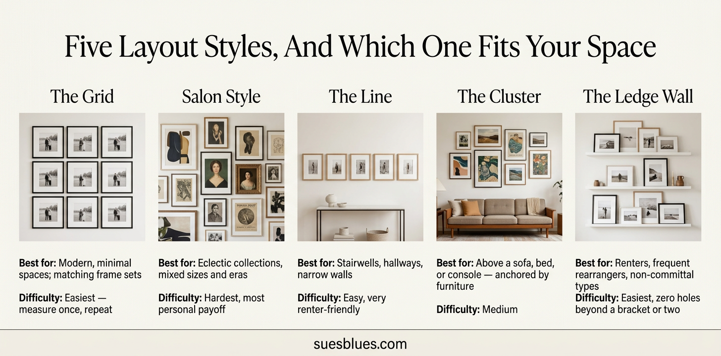
The Spacing Rules That Make It Look Intentional
View this post on Instagram
This is the part that actually separates a curated gallery wall from a cluttered one, and it’s the part almost every other post skips.
Leave 2 to 3 inches between frames. Closer than that and it reads as crowded. Farther than that and the pieces stop feeling related to each other.
Hang at eye level for the wall’s center, not any single frame. The accepted standard (museums use it too) is that the center of the whole arrangement should land around 57 to 60 inches from the floor. If it’s going above furniture, that number shifts down. Aim for 6 to 8 inches above the top of the furniture instead.
Start from the center and build outward, not from one corner. Pick your largest or most important piece, place it at the visual center of the arrangement, and build the rest around it. This is what keeps salon-style walls from tipping visually to one side.
Cut paper templates before you commit to a single nail. Trace each frame onto craft paper or newspaper, cut it out, and tape the templates to the wall in your planned arrangement. Live with it for a day, then move the templates around freely. Moving tape is a lot cheaper than patching nail holes.
View this post on Instagram
How To Mix Frames Without It Looking Like A Mistake

Mixing frame styles is what gives a gallery wall its personality, but it only works with a rule in place.
Pick one dominant frame finish (wood tone, black, or brass, for instance) and let it show up in roughly 60 to 70 percent of the frames. The remaining frames can break from it, but they should still relate: a slightly different wood tone, a different black finish, a frame with texture. What doesn’t work is total randomness: a gold frame, a white frame, a raw wood frame, and a chrome frame all in the same eight piece arrangement with nothing tying them together.
Vary the sizes deliberately. A wall of all same size frames reads as a grid even when you didn’t intend a grid. Mix in at least one small piece and one noticeably larger anchor piece.
Mats matter more than people think. A consistent mat color (or no mat at all, consistently) across mismatched frames does a lot of quiet work to unify a wall that would otherwise feel scattered.
What To Hang Besides “Art”

The best gallery walls aren’t only prints and photographs.
Mirrors, small ones especially, which bounce light around a room and are useful in the kind of smaller Bay Area layouts a lot of us are working with.
Textiles, like a small woven piece, a scarf stretched and framed, or a remnant of fabric with meaning.
Plates or ceramics, hung with plate hangers, especially if you already collect them.
Dimensional objects, such as a pressed botanical, a small shadow box, or a piece of trim or architectural salvage.
Real, unpolished personal items: a postcard from somewhere that mattered, a kid’s drawing, a ticket stub framed simply. These are usually the pieces guests actually ask about, and they’re the ones a furniture catalog version of this post will never tell you to include.
Hanging It Without Wrecking Your Walls (Renter-Friendly)
If you rent, or you just don’t want a wall full of patched holes when you eventually rearrange, here’s what actually works.
Use adhesive hanging strips rated for the actual weight of each frame. Most brands list a weight limit per strip, and it’s worth checking before you trust a heavier frame to them.
Picture ledges (mentioned above under Ledge Wall) are the lowest commitment option of all: one or two brackets total, and everything else leans and rearranges freely.
For anything with real weight, like mirrors or larger framed pieces, a single well placed nail into a stud, if you can find one, is still more reliable than adhesive alone. A stud finder is a genuinely worthwhile ten dollar tool for this project.
Command-style hooks work well for lightweight frames but tend to underperform on textured or plaster walls common in older Bay Area buildings. Test one hook in an inconspicuous spot first if you’re unsure how your specific wall will take it.
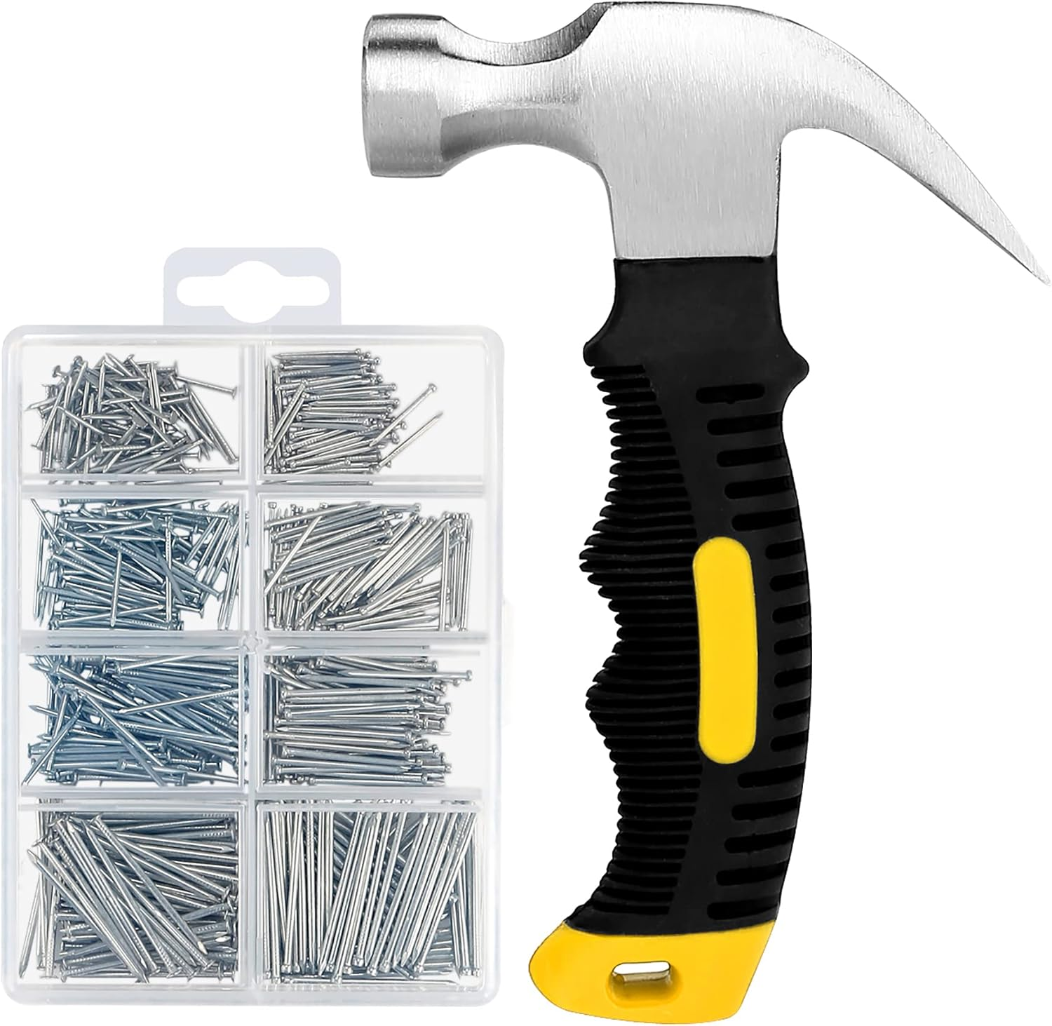 Buy the perfect kit pictured above here at this link.
The Five Mistakes That Give A Gallery Wall Away
Hanging everything too high. The instinct is to hang at “regular” eye level while standing, which is too high once you account for how much time is spent sitting in the rooms these walls are usually in.
No breathing room around the whole arrangement. The wall needs negative space around the edges of the grouping, not just between individual frames.
Ignoring the furniture beneath it. An arrangement that’s much wider or much narrower than the sofa or console below it will always look slightly off, even if you can’t immediately say why.
Skipping the floor layout step. This is the one that causes the most regret and the most patched nail holes. Ten extra minutes on the floor saves hours on the wall.
Too much of the same thing. All same size frames, all the same subject, all the same finish. It’s technically neat, but it’s the version of a gallery wall that doesn’t actually say anything about the person who made it.
FAQ
How many pieces do I need for a gallery wall? There’s no strict minimum, but five to seven pieces is a reliable starting range for a wall that reads as intentional without becoming overwhelming. You can always add over time. In fact, a wall that grows slowly tends to feel more collected than one assembled all at once.
What size wall works best for a gallery wall? Almost any wall works if the arrangement is scaled correctly. A small entryway can hold a tight cluster of four or five small pieces, while a stairwell or living room wall can support a larger salon-style spread. Scale the arrangement to the wall, not the other way around.
Should all the frames match? No, and this is the biggest misconception. A shared throughline (finish, color story, or subject matter) does more to unify a wall than matching frames do. Some of the most successful gallery walls have almost no two frames alike.
How do I keep a gallery wall from looking cluttered? Consistent spacing (2 to 3 inches between pieces), a defined edge to the overall arrangement, and negative space around the whole grouping. Clutter usually comes from inconsistent spacing, not from having “too many” pieces.
Can I do a gallery wall if I rent? Yes, picture ledges and rated adhesive strips make this fully renter-friendly, and a ledge wall in particular can be entirely rearranged without a single new hole.
Shopping List
For simple wall hangings shop my favorites here.
Good additives to any wall – frame, a mixed set or my go-to affordable frames, picture ledge, stud finder, and plate hangers.
Bay Area art and framing shops you personally use.
What does your gallery wall look like? Send a photo. I’d love to feature real ones from readers in a follow-up post.